ru

Avenir

Brand Identity for an International School

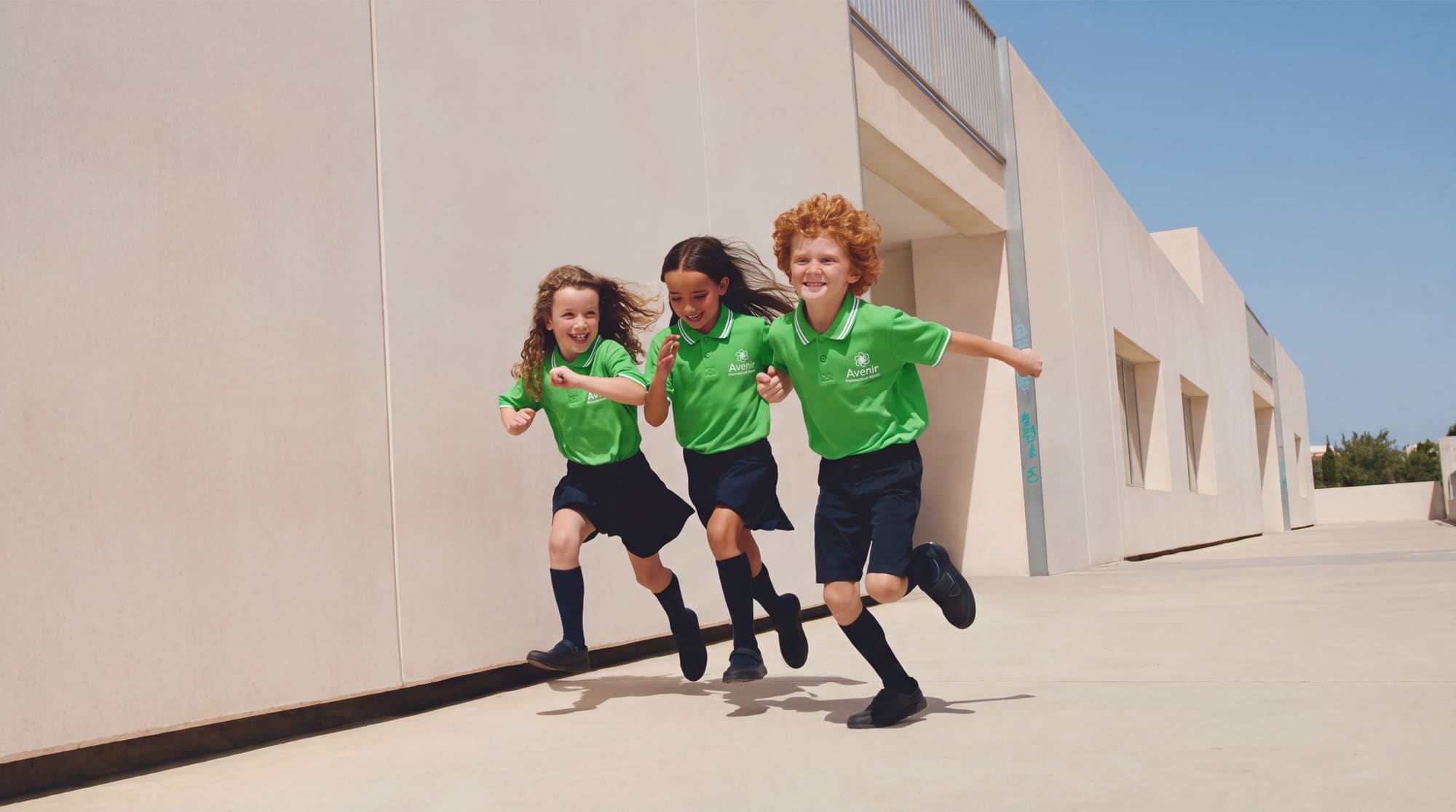
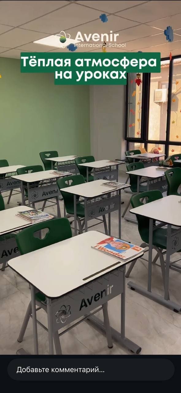
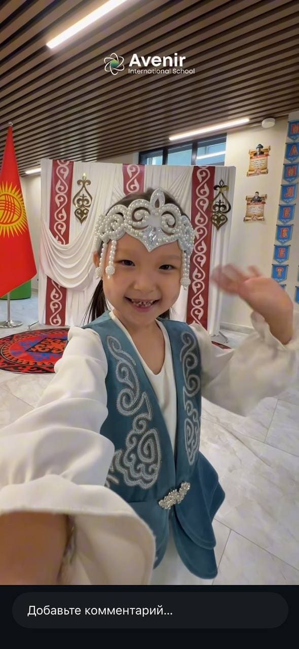
Avenir school students ru

The Task

Create a single identity for a school with two audiences under one brand:

Avenir International School

Avenir Primary School

— the senior track, which needed a restrained, “grown-up” look worthy of an international school;

— the junior track: the same brand, with a friendlier, more playful expression

The challenge was to keep one recognizable symbol across both segments while differentiating them through color, type and tone of voice, then roll the system out across every touchpoint — from letterhead to school uniforms.

Early Concepts

Two directions were explored before the final atom-and-planet symbol:

Atom monogram — orbits and electrons forming the letter “A.” Graphic, but it read like a generic tech mark and lost the metaphor of layered growth.

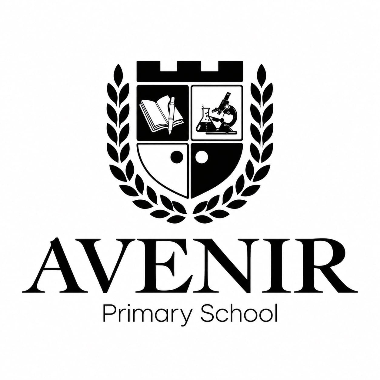
Academic crest — a heraldic shield (book, flask, microscope, castle, laurel wreath) with a classic serif wordmark. A strong “prestigious academy” feel, but too formal for a young school and too detailed to scale down for uniforms or favicons.

The Logo: Structure and Meaning

+

At the center is an atom — a symbol of beginnings, first discoveries and the drive to learn, marking the start of every student’s journey. The atom orbits a planet — a symbol of scale, wholeness and an international outlook, reflecting the program built for grades 1–12. Like Earth, the planet has five layers, from core to atmosphere, symbolizing the child’s gradual, deliberate growth at every stage of learning.

Avenir International School Avenir Primary School

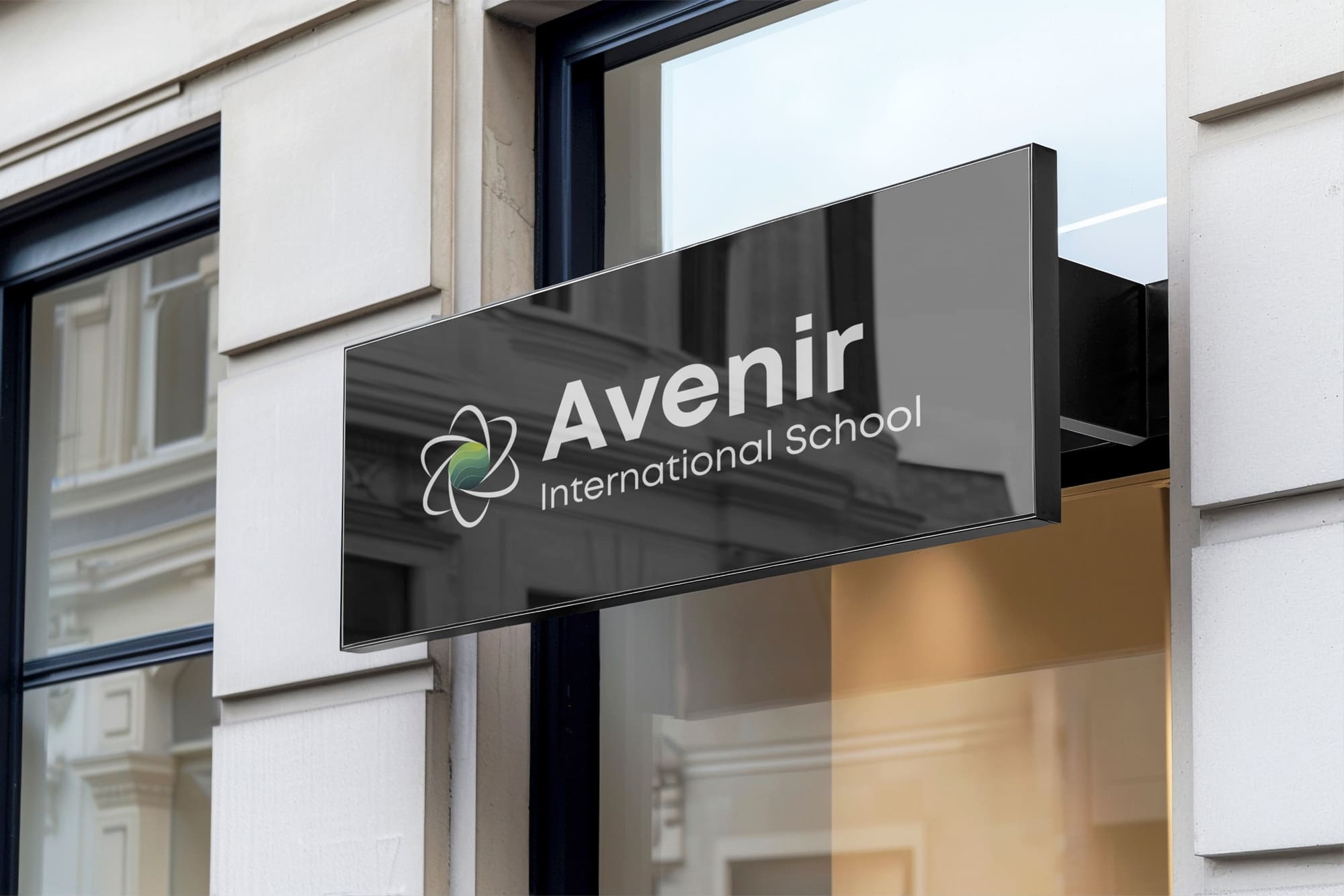
Avenir International School — a white atom around a planet in a dark-green-to-yellow gradient, paired with a strict, contemporary typeface;

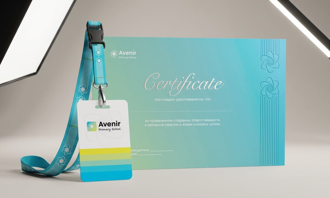
Avenir Primary School — the same atom and planet, rendered brighter and softer, with "Primary School" set in a handwritten script for a warmer, more childlike feel.

Applications

Production

Avenir

Brand Identity for an International School

Avenir school students

The Task

Create a single identity for a school with two audiences under one brand:

Avenir International School

— the senior track, which needed a restrained, “grown-up” look worthy of an international school;

Avenir Primary School

— the junior track: the same brand, with a friendlier, more playful expression

The challenge was to keep one recognizable symbol across both segments while differentiating them through color, type and tone of voice, then roll the system out across every touchpoint — from letterhead to school uniforms.

Early Concepts

Two directions were explored before the final atom-and-planet symbol:

Atom monogram — orbits and electrons forming the letter “A.” Graphic, but it read like a generic tech mark and lost the metaphor of layered growth.

Academic crest — a heraldic shield (book, flask, microscope, castle, laurel wreath) with a classic serif wordmark. A strong “prestigious academy” feel, but too formal for a young school and too detailed to scale down for uniforms or favicons.

The Logo: Structure and Meaning

+

At the center is an atom — a symbol of beginnings, first discoveries and the drive to learn, marking the start of every student’s journey. The atom orbits a planet — a symbol of scale, wholeness and an international outlook, reflecting the program built for grades 1–12. Like Earth, the planet has five layers, from core to atmosphere, symbolizing the child’s gradual, deliberate growth at every stage of learning.

Avenir International School

Avenir International School — a white atom around a planet in a dark-green-to-yellow gradient, paired with a strict, contemporary typeface;

Avenir Primary School

Avenir Primary School — the same atom and planet, rendered brighter and softer, with "Primary School" set in a handwritten script for a warmer, more childlike feel.

Applications
Production

Contact

Start a project

Quick intro brief