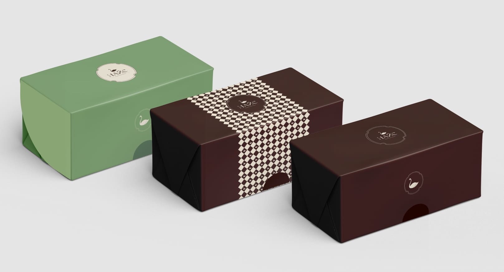
Confectionery · Rebranding
Swan & Cream Nice
A new identity for the Nice confectionery: the familiar swan, now made of whipped cream.
01 — Logo
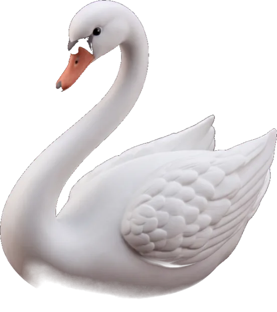


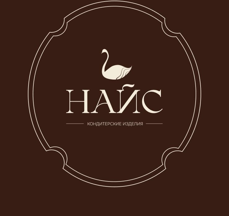
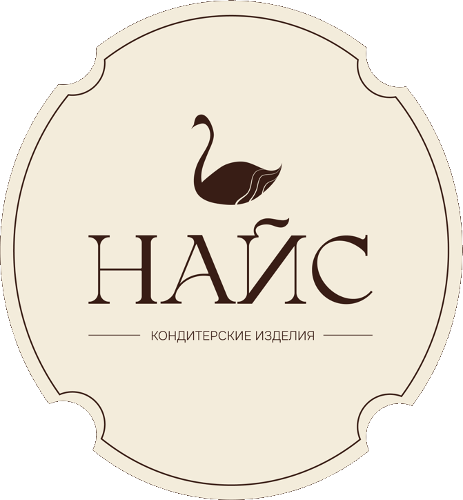
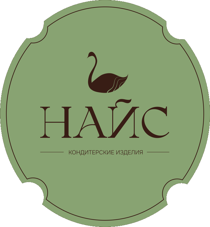
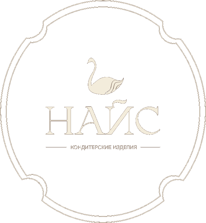
The logo is built around the swan — a symbol that was already part of the brand and was kept as its main image. We combined the swan’s form with an element associated with confectionery: the bird’s tail is drawn as soft curls reminiscent of whipped cream or frosting.
This unites the brand symbol and the product category in a single visual metaphor. The swan keeps its graceful shape and recognizability, while the creamy texture evokes delicate desserts and pastries.
A decorative frame completes the logo, giving it a finished, classic feel and reinforcing the sense of care and premium quality — like pastry box designs and signature seals.
02 — Colors
RGB 56 29 21
CMYK 0 48 62 78
RGB 243 236 219
CMYK 0 3 10 5
RGB 136 163 114
CMYK 17 0 30 36
03 — Typography
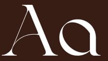
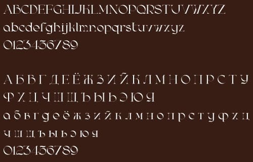
Bergamasco — for headings
Onest — for body text
ABCDEFGHIJKLMNOPQRSTUVWXYZ
abcdefghijklmnopqrstuvwxyz
0123456789
04 — Brand in use
Hover over a line to see it