Hotel · Naming & Branding
Orno Hotel
Naming, logo and brand identity for a new hotel
The task
Develop a name in the spirit of the options the client already liked: light, modern, international, and evoking travel, coziness and comfort.
What we did
- 01Naming
- 02Logo
- 03Brand identity
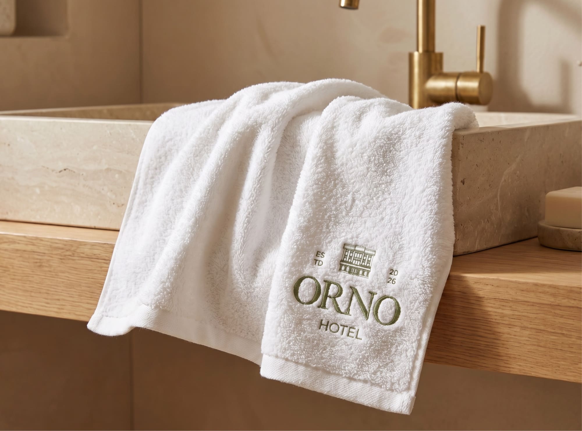
- 04Touchpoints
Naming
Directions
- 01 National and cultural roots Names inspired by local culture, nature and Turkic aesthetics, creating a sense of authenticity and character.
- 02 The spirit of the road Names that carry a sense of the road, freedom, rest and warm hospitality.
- 03 Simple, international forms Concise forms that make a name modern, memorable and clear to a wide audience.
Name options
Every option was checked against trademark registers in Kyrgyzstan and Kazakhstan — two already had similar marks.
Why Orno
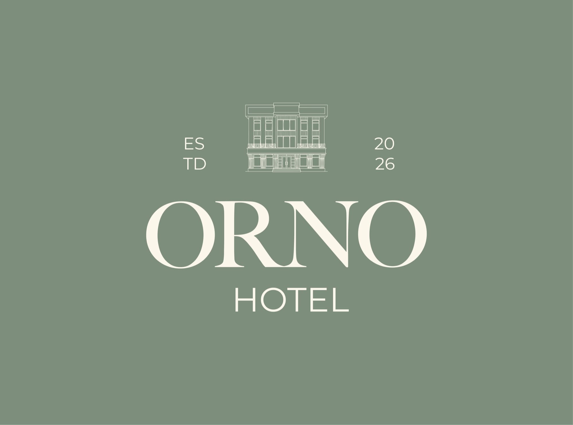
Of ten options, the client chose Orno — a name that evokes ornament, aesthetics and national motifs. It is short, easy to say in any language and leaves room for a strong visual identity.
Logo
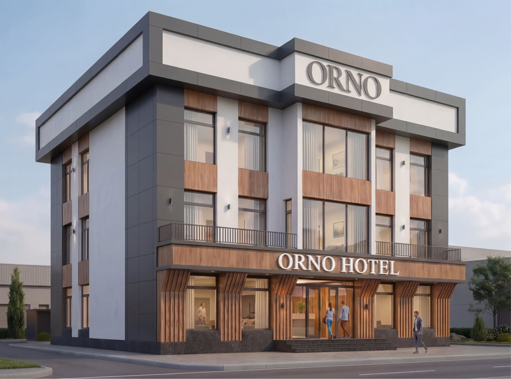
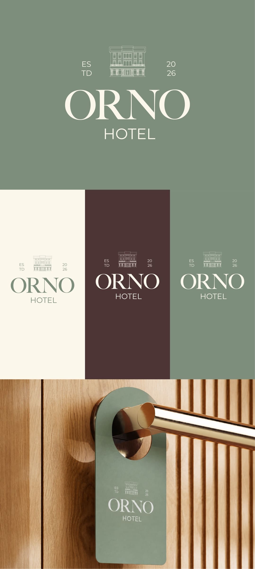
The ORNO Hotel logo is built around the hotel building itself, which became the brand’s main symbol and reflects its architectural character.
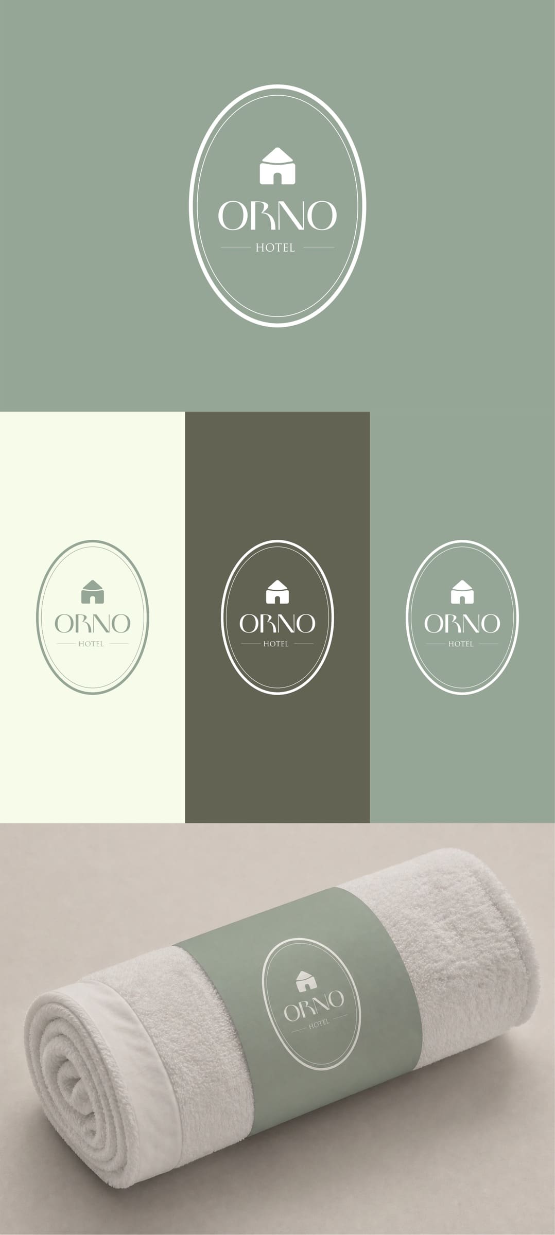
Logo concepts
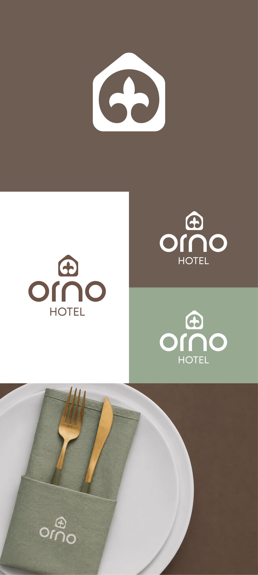
Final logo
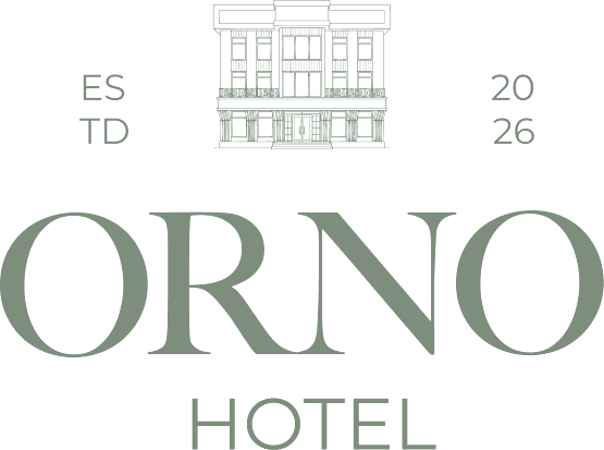
At its core is a fine-line drawing of the hotel’s facade, emphasizing status, recognizability and a sense of place.
ORNO is set in Baskerville — classic, expressive and elegant — conveying premium quality and a high level of service. The plainer HOTEL lettering balances the name and keeps the logo modern, clean and restrained.
Identity
Beige, olive and brown tones create a sense of calm, comfort and understated luxury.
Colors
RGB 252 247 235
RGB 125 142 125
RGB 76 53 53
Typography
Baskerville underlines the brand’s premium character, the hotel’s status and its architectural aesthetic. Supporting text is set in Montserrat, which is highly legible and works across signage, print, digital and every branded touchpoint.
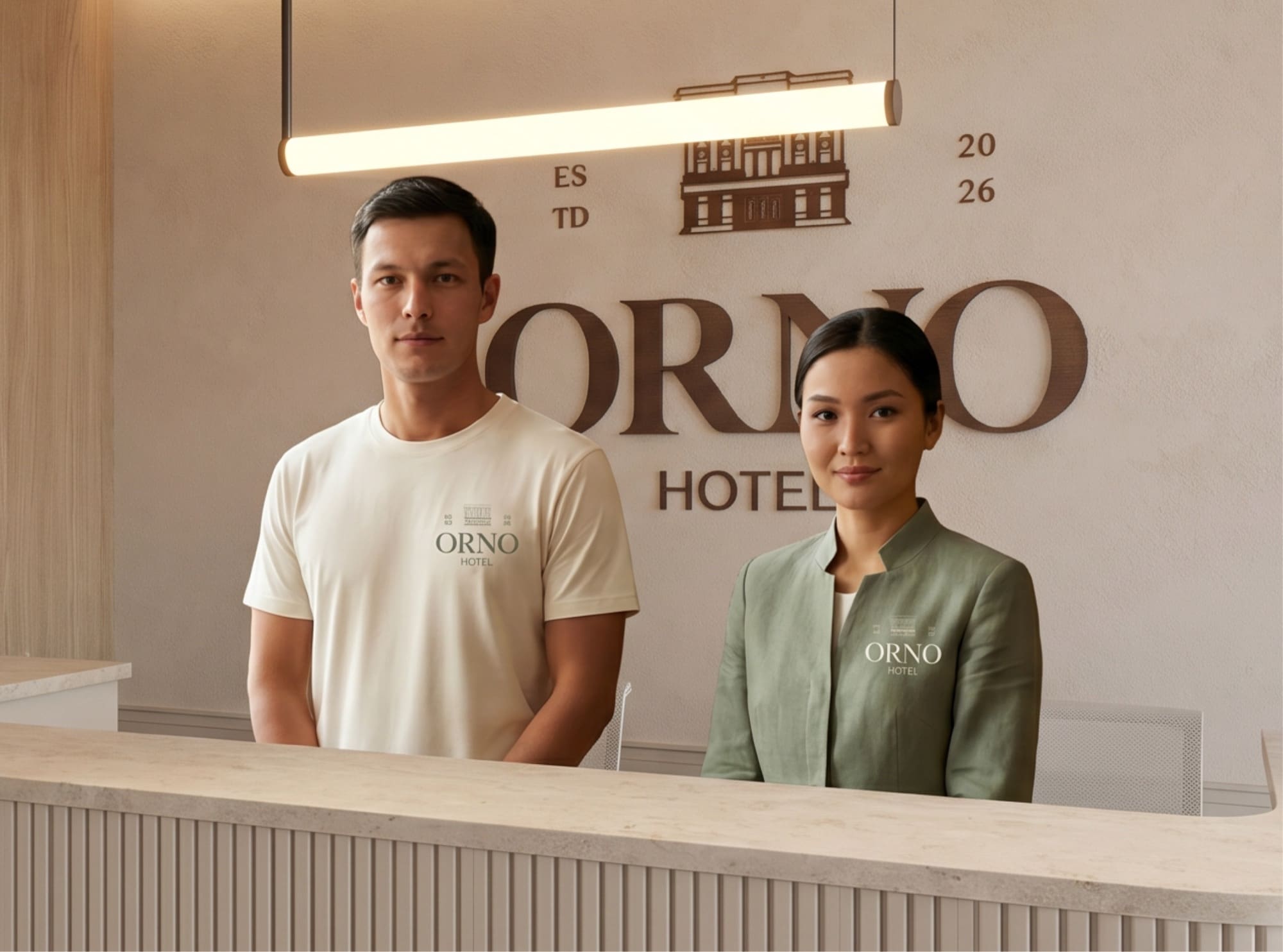
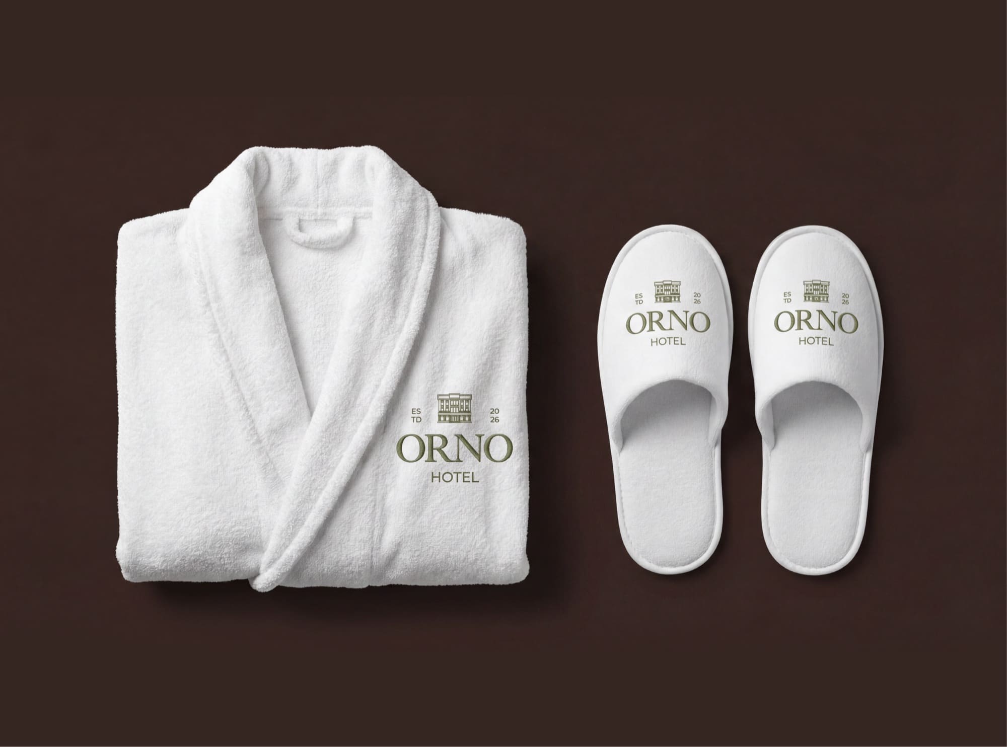
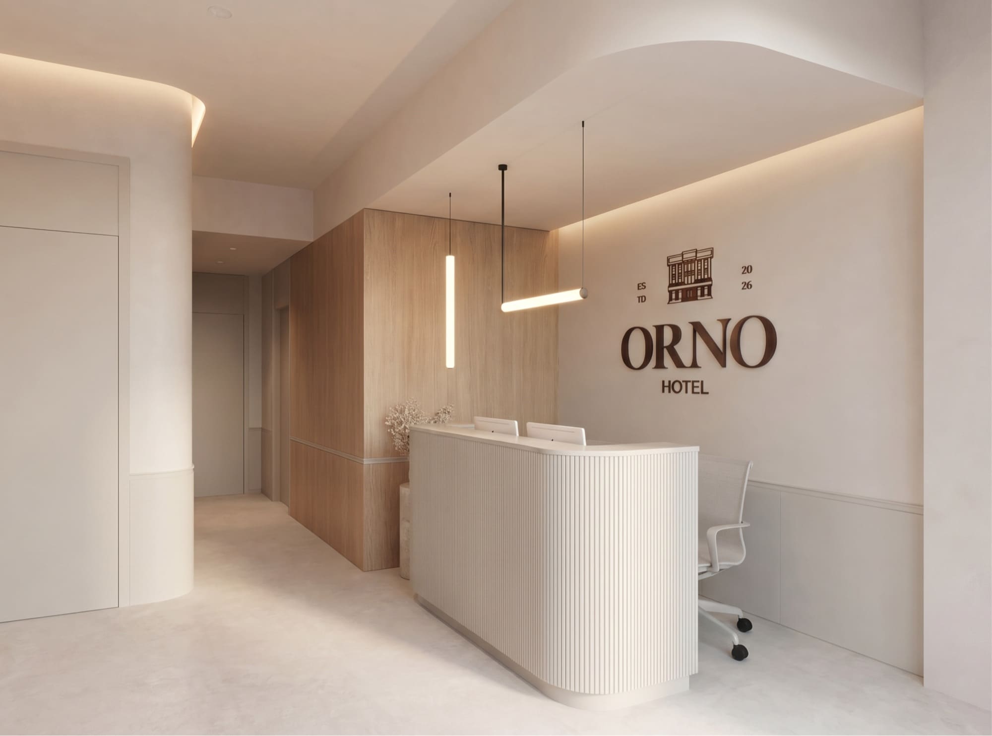
Touchpoints